Choosing the best applique letters and fonts is not just about finding a style that looks good on a screen. When I prepare lettering for applique, I look at the fabric shape, border width, letter size, and how much space the needlework needs to hold everything together. Good applique embroidery digitizing starts with a font that can handle those physical limits.
A font may look strong in a design program but behave very differently once you cut the fabric, place it, tack it down, and cover it with a border. I have seen simple lettering stay clean while a more decorative style created weak corners and messy edges. That is why I check the structure of each letter before deciding how it should be stitched.
Why Most Fonts Fail in Machine Applique

Machine applique has a different job from regular embroidered lettering. Instead of building the whole letter with thread, the design uses fabric pieces for the main shapes and stitches to secure and finish those pieces. The placement, tack-down, and cover stitches all have to work together.
This makes font selection much more important than many beginners expect. A font with narrow openings or very thin parts may look attractive in artwork but leave too little room for a clean fabric edge.
How Applique Lettering Differs From Regular Embroidery Lettering
Regular embroidery lettering builds the letter mainly through thread. Applique lettering uses a fabric layer as part of the letter, followed by stitches that hold and cover its edge.
That difference changes how I judge a font.
With regular lettering, a thin stroke may still work because the digitizer can adjust stitch density, underlay, and stitch length. With applique, the fabric itself needs enough width to stay in place and give the finishing stitches something solid to cover.
The basic structure usually includes:
- A placement or outline stitch.
- The applique fabric placed over the marked area.
- A tack down stitch to hold the fabric.
- A final cover stitch, commonly a satin border.
The exact sequence depends on the design and software setup. Wilcom, for example, includes placement, tack-down, and cover-stitch functions for applique objects.
Common Problems with Wrong Font Creates
A poor font choice can create trouble even when the fabric and stabilizer are suitable. The biggest problems usually appear around edges, corners, small openings, and narrow connections.
Fraying Fabric Edges
Thin or detailed letter shapes leave less room for the cover stitch to catch the fabric edge. When that border can't cover the edge properly, small fibers can remain visible.
The problem becomes more noticeable with fabrics that have a loose weave. I usually look at the outer shape first and ask a simple question: does this letter leave enough material for the border to hold?
Gaps Between the Fabric and the Satin Border
A clean satin border should sit close to the applique fabric edge. If the letter shape has sharp changes or narrow sections, the border may not cover evenly.
This can leave tiny gaps where the base fabric shows through. Those gaps may look minor on a computer screen but become obvious on a finished garment.
Letters That Pucker or Distort
Too much stitching in a small area can pull the fabric in different directions. Poor stabilization can add to the problem, but the letter shape itself can also create stress.
I pay close attention to tight corners and narrow joins because several stitch paths may meet there. The goal is not simply to make the border thicker. The entire letter needs enough room for the fabric, tack-down, and cover stitches to work together.
Font Features That Hold Up in Applique Stitching

A good applique font has a strong basic shape. You don't need a complicated typeface to create attractive lettering. In many cases, simple shapes give the digitizer more control and produce cleaner results.
Thick and Consistent Stroke Width
Look for letters with reasonably even strokes. Large differences between thick and thin areas can make fabric pieces harder to cut and cover.
A consistent stroke also gives the satin border a more predictable path. When I prepare lettering, I would rather start with a strong shape than try to repair a weak one with heavy stitching later.
Open Counters and Simple Letter Shapes
Counters are the open spaces inside letters such as A, B, P, R, and O. These spaces need enough room for the fabric shape and border to remain clear.
An open counter gives the letter room to breathe. A very small counter can disappear after the border is added, especially when the complete design is reduced for a smaller garment.
Simple letter shapes also make trimming easier. This matters because applique fabric needs accurate cutting around the stitched shape.
Minimal Sharp Corners and Thin Connectors
Sharp points can be difficult because fabric does not behave like a digital outline. At a narrow point, the fabric may shift slightly or the border may need to change direction quickly.
Thin connectors create a similar problem. If a section becomes too narrow, there may not be enough material for a stable applique piece.
Rounded corners and stronger connections usually give the digitizer more room to build a clean stitch path.
Why Serifs and Fine Details Cause Trouble
Small serifs, hairlines, and decorative cuts can look excellent in printed artwork. Applique has different limits.
A tiny serif may become too small to cut cleanly. A narrow gap may close under the border. A fine decorative feature may simply disappear after stitching.
That doesn't mean every serif font is a poor choice. Large, chunky serif shapes can work very well. The important point is to judge the actual letter size rather than the font name.
Best Font Styles for Machine Applique
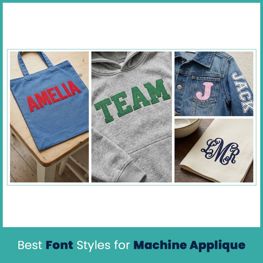
Block and Bold Sans Serif Fonts
Bold sans serif styles are usually a practical starting point. Their simple shapes provide clear fabric areas and strong outer edges.
Letters such as A, E, H, M, O, and S tend to be easier to prepare when their strokes have enough width. These styles also work well for names, team lettering, school designs, and business marks where clear reading matters.
Chunky Slab Serif Fonts
A heavy slab serif can give applique lettering more character without adding fragile details.
The key is thick. Large, strong serifs can stay visible and provide enough space for a border. Very thin traditional serifs create a different set of problems, especially at smaller sizes.
Rounded and Varsity Styles
Rounded fonts work nicely when you want a softer appearance. Varsity-style lettering also suits sports shirts, jackets, school clothing, and team designs.
I still check the inside spaces before using these styles. A varsity font may have thick outer strokes but surprisingly small openings inside letters. Those openings need enough room to remain recognizable.
Can You Use Script Fonts for Applique?
Yes, but script requires more care.
Connected letters can create long narrow areas, overlapping shapes, and tight spaces. If the script becomes too thin, the fabric piece may not have enough strength to stay neat.
What to Look for in a Thick Script
Choose a script with:
- Heavy strokes.
- Clear connections.
- Wide openings.
- Limited crossing points.
- Rounded rather than extremely sharp turns.
- Enough space between neighboring letters.
For a short name or word, a thick script can look excellent. I would test it before committing to the final size because script lettering can change quickly when reduced.
Font Styles to Avoid Completely
There is no single font list that works for every project, but some characteristics deserve caution:
- Extremely thin strokes
- Hairline serifs
- Very narrow connectors
- Tiny decorative details
- Crowded letter spacing
- Deep, narrow counters
- Complex outlines inside small letters
- Fonts that depend on very fine points
The issue is not whether the font looks attractive. The issue is whether the physical shape gives the fabric and stitches enough room.
How Letter Size Changes Your Font Choice
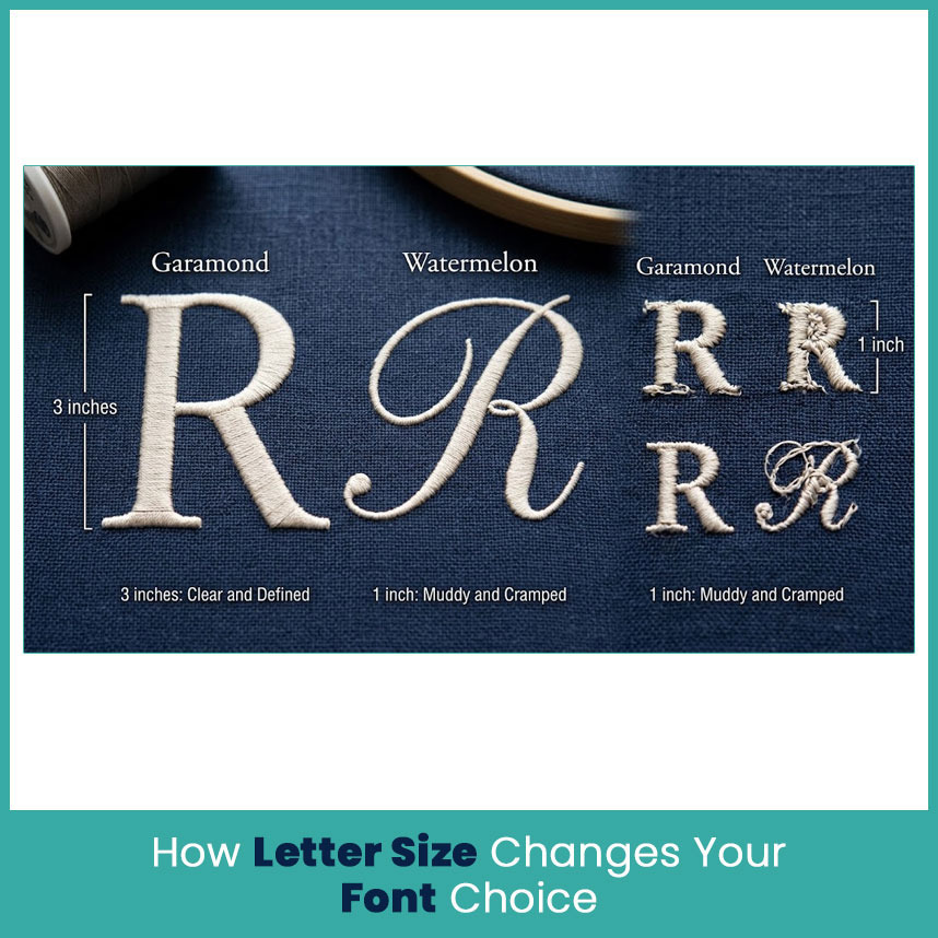
Font selection and size should never be treated as separate decisions.
A style that works beautifully at four inches may become difficult at one inch. The smaller the letter becomes, the less room remains for fabric, tack-down stitches, and the final border.
Small Letters Need Simpler Fonts
Small lettering needs fewer details.
At a smaller height, I normally look for wider strokes, open counters, and clean outer shapes. If the design contains many tiny details, removing those details can produce a better result than trying to preserve every feature.
This is also where stitch planning matters. Small areas cannot handle unlimited stitch density. Wilcom's current documentation notes that tiny lettering needs lighter density and shorter stitch lengths, with appropriate underlay support depending on the object.
Why Some Fonts Work at 3 Inches but Fail at 1 Inch?
At three inches, a letter has enough physical space for its curves, openings, and borders. At one inch, those same features become much tighter.
Take the letter R as an example. The bowl and legs may look clear at three inches. Reduce it to one inch, and the opening can become cramped while the diagonal leg gets very narrow.
That is why simply shrinking a successful design does not always give you another successful size.
How to Test a Font Before the Final Stitch-Out?
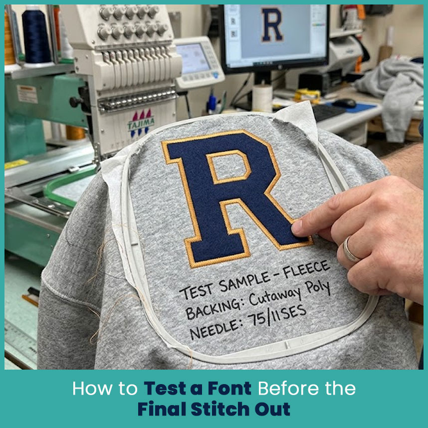
A test sample tells you much more than a screen preview. I recommend testing the actual fabric, backing, and thread combination whenever the lettering matters.
Madeira also recommends testing stabilizer and fabric combinations before using them for embroidery work.
Do a Test Stitch on the Same Fabric
Don't test on a random piece of cotton when the final garment uses fleece, twill, knit, or another material.
The fabric affects movement, edge stability, and how the stitches sit. A font that looks clean on firm twill may need different treatment on a stretchy shirt.
For applique, also use the same type of fabric planned for the letter. The thickness and weave can change how the border covers the edge.
What to Check on the Sample
Look at the sample from a normal viewing distance, then inspect it closely.
Tack-Down Stitch Coverage
The tack-down needs to hold the fabric securely without creating unnecessary bulk. If the fabric shifts before the cover stitch reaches the edge, the final border may not line up properly.
Satin Border Edges
Check whether the satin border covers the applique edge consistently.
Watch the inside corners especially. If you see exposed fabric in one area and too much border in another, the letter shape or stitch settings may need adjustment.
Fabric Movement and Stabilizer Support
Check the base fabric for rippling or shifting. A suitable stabilizer helps support the material while the needle moves through it.
For applique, Madeira describes the use of backing and heat-seal or adhesive materials to keep layers together and reduce movement between fabrics.
Digitizing Settings That Protect Your Font Choice
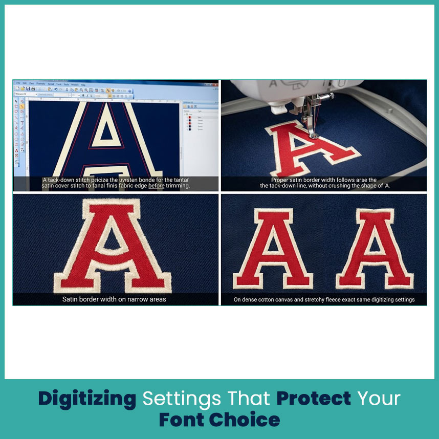
Even a strong font needs proper digitizing. The font gives you the shape, but stitch planning determines how that shape behaves.
Tack-Down Stitch Placement
The tack-down should hold the applique piece close enough to the intended shape for the cover stitch to finish the edge cleanly.
If it sits too far inside, the fabric edge may shift. If it sits too close to the edge, trimming becomes harder and the cover stitch may not have enough room.
Modern embroidery software can build placement, tack-down, and cover components as part of an applique object, but the settings still need to suit the actual design.
Satin Border Width
The border needs enough width to cover the fabric edge without making small areas too heavy.
A wider satin border is not automatically better. On a narrow letter, adding too much width can close an opening or change the shape of the character.
I check the border against the narrowest part of the letter rather than judging it only from the largest section.
Pull Compensation for Applique Letters
Fabric and stitches can shift in different directions as the needle penetrates the design. Pull compensation helps account for that movement.
Wilcom's documentation specifically describes pull compensation as part of stitch settings and notes that fabric type can change the amount needed.
For that reason, I would not use one compensation setting for every applique project. Cotton, twill, fleece, and stretchy garments can react differently.
Matching Fabric, Stabilizer and Needle to Your Font
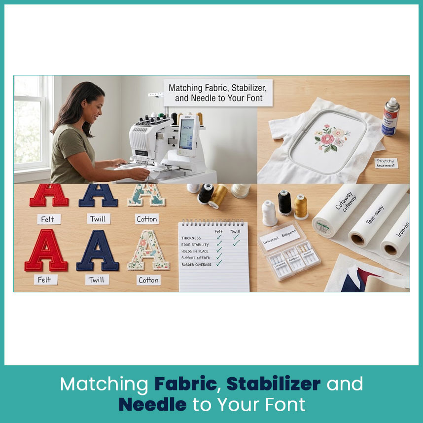
The same lettering can behave differently on different materials. That is why font selection should happen alongside fabric selection.
Felt vs Twill vs Cotton for Applique Letters
Felt gives you a firm, stable material with a clean edge. Twill also works well for bold shapes and has enough body for many lettering projects.
Cotton gives you more flexibility, but its behavior depends on its weight and weave. A lightweight cotton may need more support than a firm twill.
For each material, I check:
- Thickness of the applique fabric
- Edge stability after cutting
- How well the material stays in place
- Amount of support needed underneath
- Whether the border covers the edge cleanly
The goal is to match the material to the letter shape instead of forcing every project into the same setup.
Stabilizer Choice for Stretchy Garments
Stretchy garments need special attention because the base material can move while the needle works through it.
A suitable cutaway or other backing can give the fabric more support. Madeira's applique guidance recommends backing for the base fabric and explains that adhesive materials can help keep applique layers from shifting.
I also check the garment after removing it from the hoop. A design can look fine while hooped and show rippling once the fabric relaxes.
FAQs
Q1. Can I use any font for machine applique?
Not every font works well. Thick strokes, open spaces, and simple shapes usually give you more room for a stable fabric piece and clean border.
Q2. Are script fonts good for applique?
They can work when the script has thick strokes, clear connections, and enough space between details. Always test smaller script lettering before using it on the final garment.
Q3. What is the safest font style for beginners?
A bold block or simple sans serif style is usually easier to understand, cut, and stitch because it has fewer fragile details.
Q4. How do I know if a font will work before stitching?
Check the smallest strokes, counters, corners, and spacing first. Then make a test sample using the same fabric, stabilizer, and thread planned for the final piece.
Author Bio
Matthew Davis
Senior Embroidery Digitizer
I'm Matthew Davis, a skilled embroidery digitizer with more than 15 years of practical experience. I specialize in logo digitizing, 3D puff embroidery designs, applique digitizing, custom embroidery digitizing, and working with difficult fabrics.
Over the years, I have worked with different fashion brands and production teams worldwide. I always share simple tips and useful techniques to help both beginners and businesses improve their embroidery work.